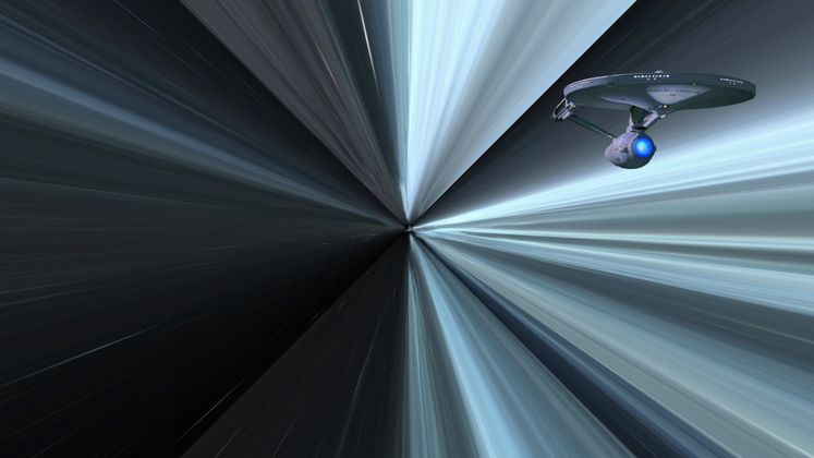
Here is a fun wormhole experiment!
HTML
<div class="ship"></div>
<div class="scene scene1">
  <div class="wrap">
    <div class="wall wall-right"></div>
    <div class="wall wall-left"></div>
    <div class="wall wall-top"></div>
    <div class="wall wall-bottom"></div>
    <div class="wall wall-back"></div>
  </div>
  <div class="wrap">
    <div class="wall wall-right"></div>
    <div class="wall wall-left"></div>
    <div class="wall wall-top"></div>
    <div class="wall wall-bottom"></div>
    <div class="wall wall-back"></div>
  </div>
</div>
CSS
.wall{
  background: url(https://i.imgur.com/i1xdL.jpeg);
  background-size: cover;
}

html, body{
  height: 100%;
  width: 100%;
  overflow: hidden;
  margin: 0;
}

body{
  background: #000;
  text-align: center;
}

body:before {
  content: '';
  display: inline-block;
  height: 100%;
  vertical-align: middle;
}

.scene {
  display: inline-block;
  vertical-align: middle;
  perspective: 5px;
  perspective-origin: 50% 50%;
  position: relative;
}

.wrap{
  position: absolute;
  width: 1000px;
  height: 1000px;
  left: -500px;
  top: -500px;
  transform-style: preserve-3d;
  animation: move 20s infinite linear;
  animation-fill-mode: forwards;
}

/* .wrap:nth-child(2){
  animation: move 20s infinite linear;
  animation-delay: 6s;
} */

.wall {
  width: 100%;
  height: 100%;
  position: absolute;
/*   animation: fade 20s infinite linear; */
  animation-delay: 0;
}

.wrap:nth-child(2) .wall {
  animation-delay: 6s;
}

.wall-back {
  opacity: 0.5;
}

.wrap .wall-right {
  transform: rotateY(90deg) translateZ(500px);
}

.wrap .wall-left {
  transform: rotateY(-90deg) translateZ(500px);
}

.wrap .wall-top {
  transform: rotateX(90deg) translateZ(500px);
}

.wrap .wall-bottom {
  transform: rotateX(-90deg) translateZ(500px);
}

.wrap .wall-back {
  transform: rotateX(180deg) translateZ(500px);
}

@keyframes move {
  0%{
    transform: translateZ(500px) rotate(0deg);
  }
  100%{
    transform: translateZ(-500px) rotate(0deg);
  }
}

@keyframes fade {
  0%{
    opacity: 0;
  }
  25% {
    opacity: 1;
  }
  75% {
    opacity: 1;
  }
  100%{
    opacity: 0;
  }
}

.ship {
  position: absolute;
  z-index: 1;
  top: 120px;
  right: 100px;
  bottom: 0;
  height: 170px;
  width: 350px;
  background-size: cover;
  background-repeat: no-repeat;
  background-position: center center;
  background-image: url('Place your starship image here...')
}

@keyframes 🤫 {
  0%{
    filter: hue-rotate(0)
  }
  50% {
    filter: hue-rotate(180deg) saturation(5);
    transform: scaleX(4000);
    perspective: 50px;
  }

  100%{
    filter: hue-rotate(360deg);
  }
}


Top comments (2)
Top 👍